Speech Balloons 101: American Comics vs. Manga Dialogue Flow
Whether you are drawing an action-packed superhero adventure or a slice-of-life manga, one critical element often gets overlooked: speech balloon design and placement.
Many aspiring comic artists focus heavily on character anatomy, dynamic angles, and detailed backgrounds, only to slap text boxes onto the page as an afterthought. However, speech balloons are the invisible map that guides your reader’s eyes across the page. Poor balloon placement creates visual friction, leaving readers confused about panel order or reading flow
In this guide, we break down the fundamental rules of comic lettering, contrasting Western (American) comic layout with Japanese manga traditions so you can elevate your indie graphic novel to a professional standard.
1. Reading Direction: Z-Path vs. Reverse Z-Path
The fundamental difference between American comic books and Japanese manga stems from native reading direction.
-
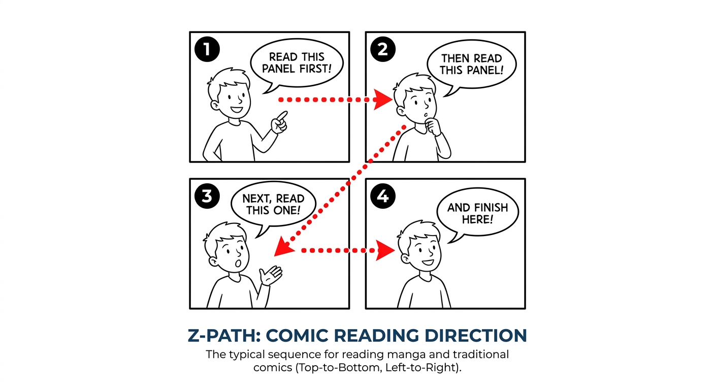
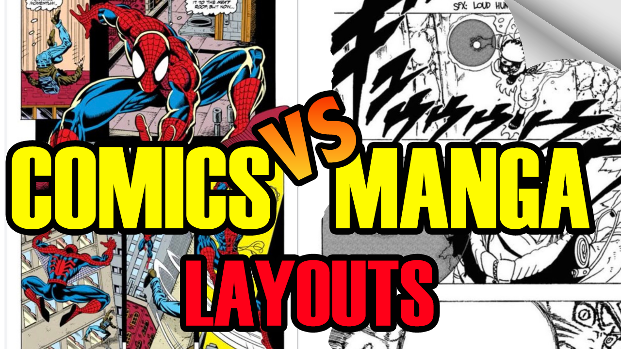
American Comics (Left-to-Right): Western comics follow the standard Z-path. The reader’s eyes move from the top-left of the page across to the top-right, down diagonally to the bottom-left, and finally across to the bottom-right
-
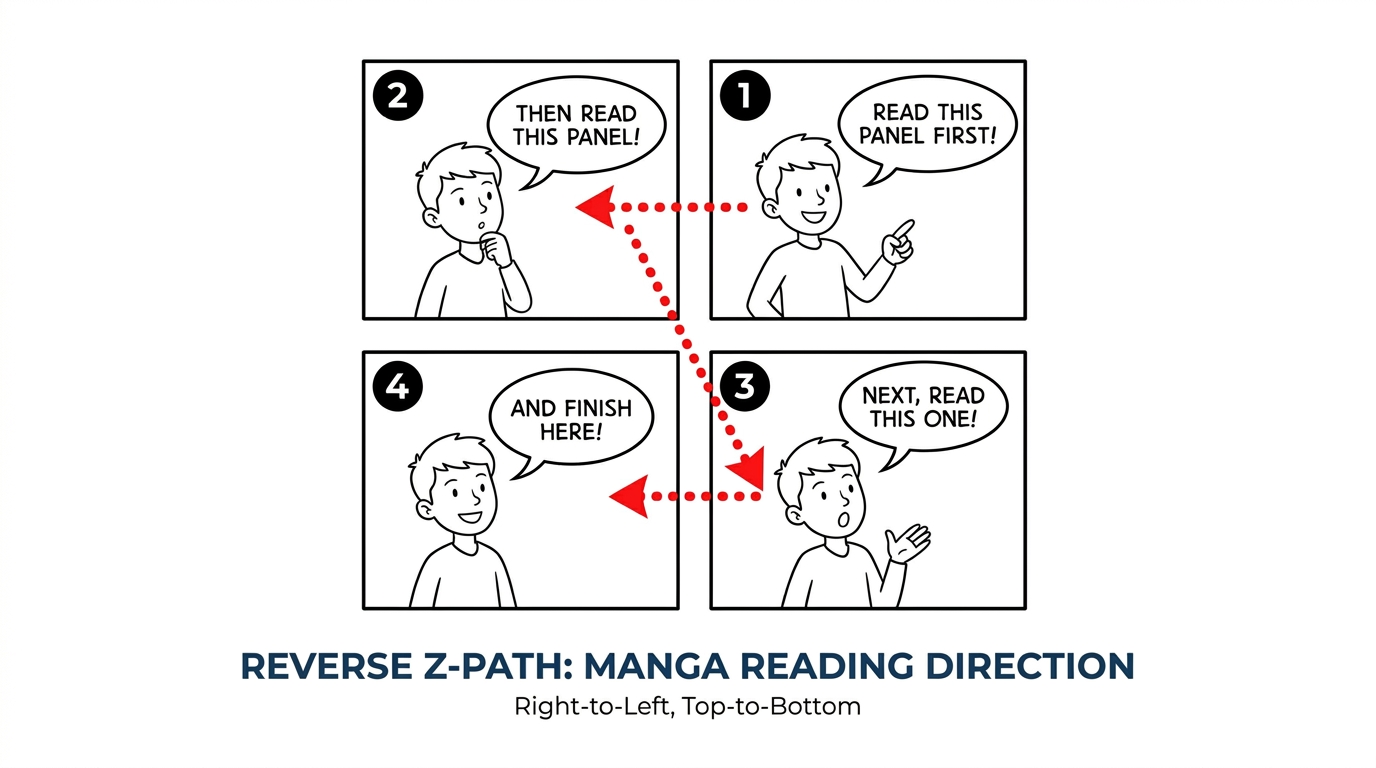
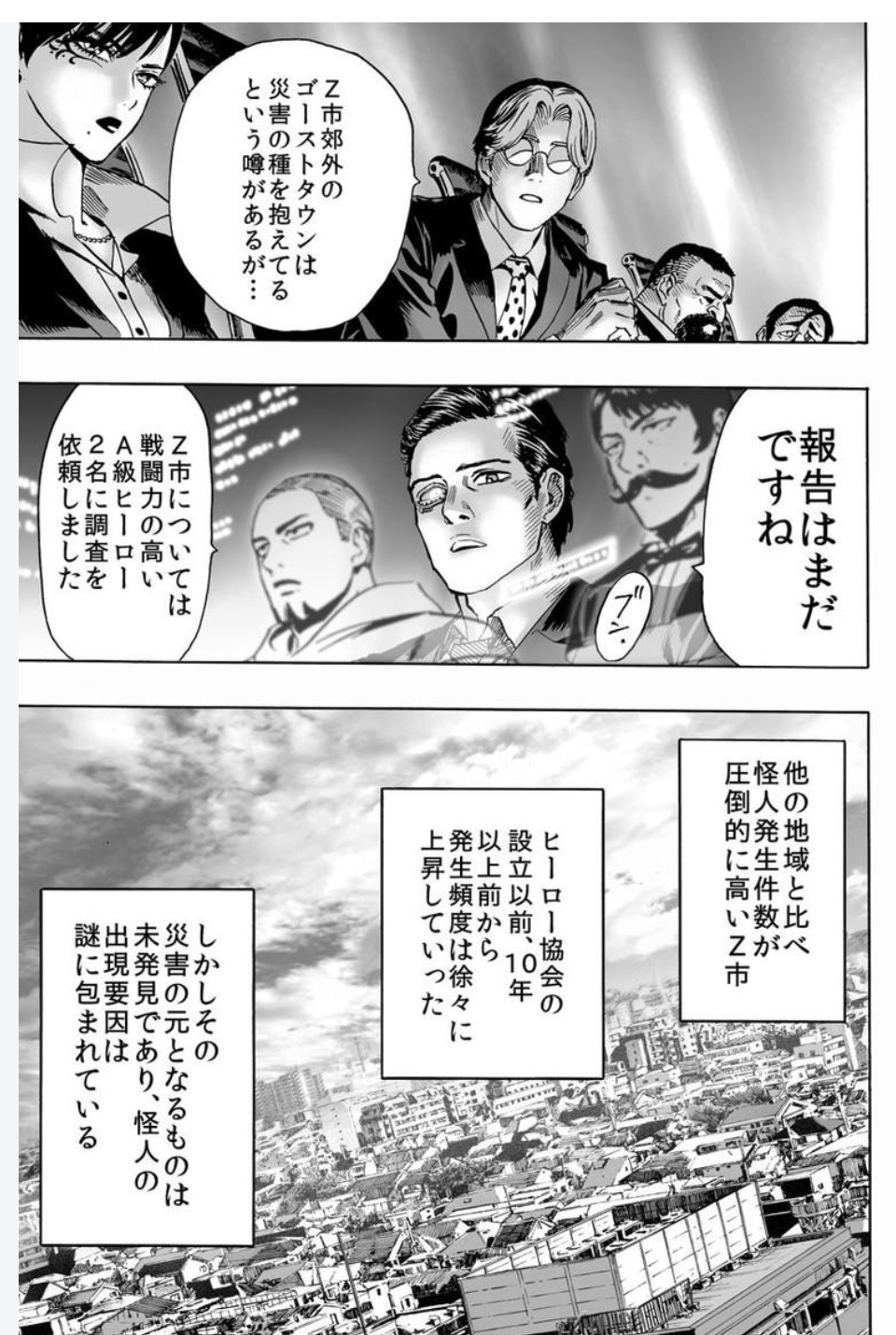
Manga (Right-to-Left): Japanese text is traditionally written vertically and read from right to left. As a result, manga uses a Reverse Z-path. The highest panel on the top-right corner is read first, cascading down toward the bottom-left
Pro Tip: When translating or adapting a Western comic to a manga layout (or vice versa), balloon placement must be adjusted to match the audience’s natural eye movement.
2. Balloon Shapes: Horizontal Ovals vs. Vertical Tall Balloons
The visual shape of a speech balloon is directly tied to the language being written inside it.
-
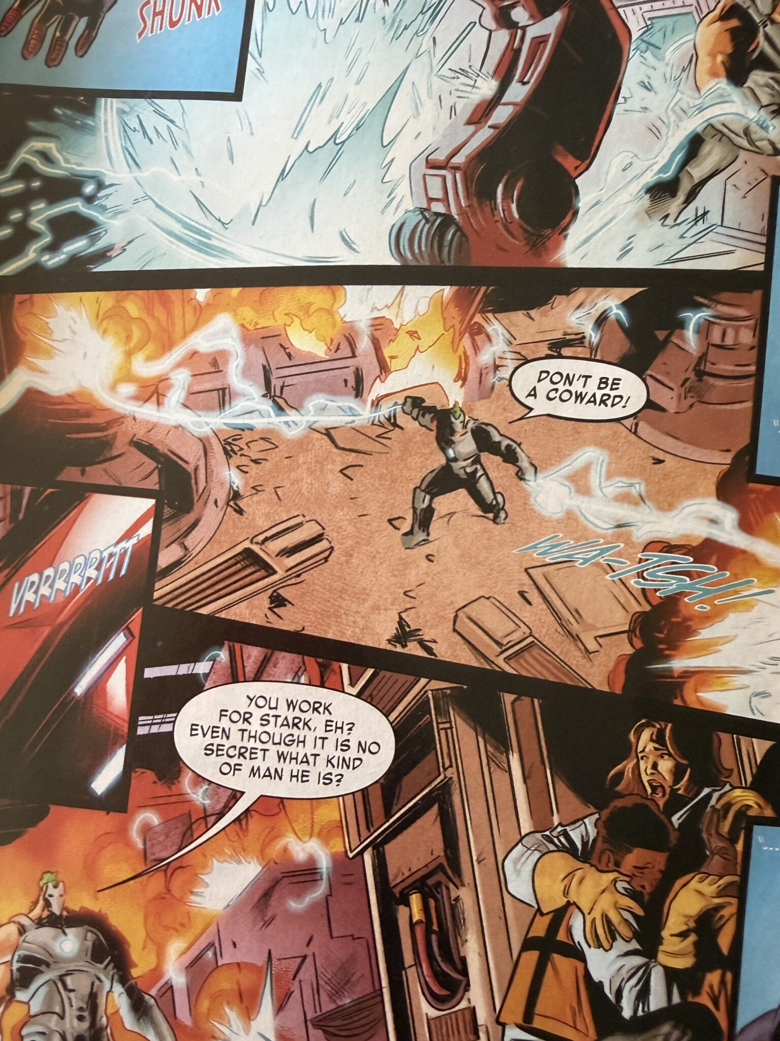
Western Horizontal Shapes: English text reads horizontally in left-to-right lines. Consequently, wide oval or horizontal rectangular balloons naturally fit English sentences without leaving awkward, empty gaps.
-
Manga Vertical Shapes: Japanese text is written top-to-bottom. Manga speech balloons are traditionally vertical ovals or tall rectangles designed to cleanly frame vertical columns of Japanese characters.
3. The Lettering Rules: Padding & Tail Positioning
Regardless of the comic style you choose, two universal mechanics dictate whether your lettering looks clean or amateurish:
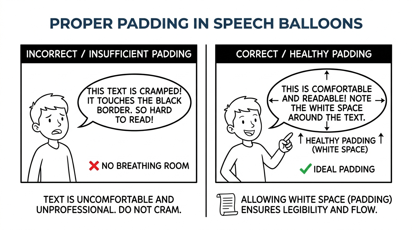
Healthy Padding (White Space)
Always leave comfortable breathing room—known as padding—between your text and the black inner border of the speech balloon. Text should never touch or crowd the balloon outlines. Adequate white space ensures instant legibility,even on mobile screens or small print editions.
The 1/3 Rule for Balloon Tails
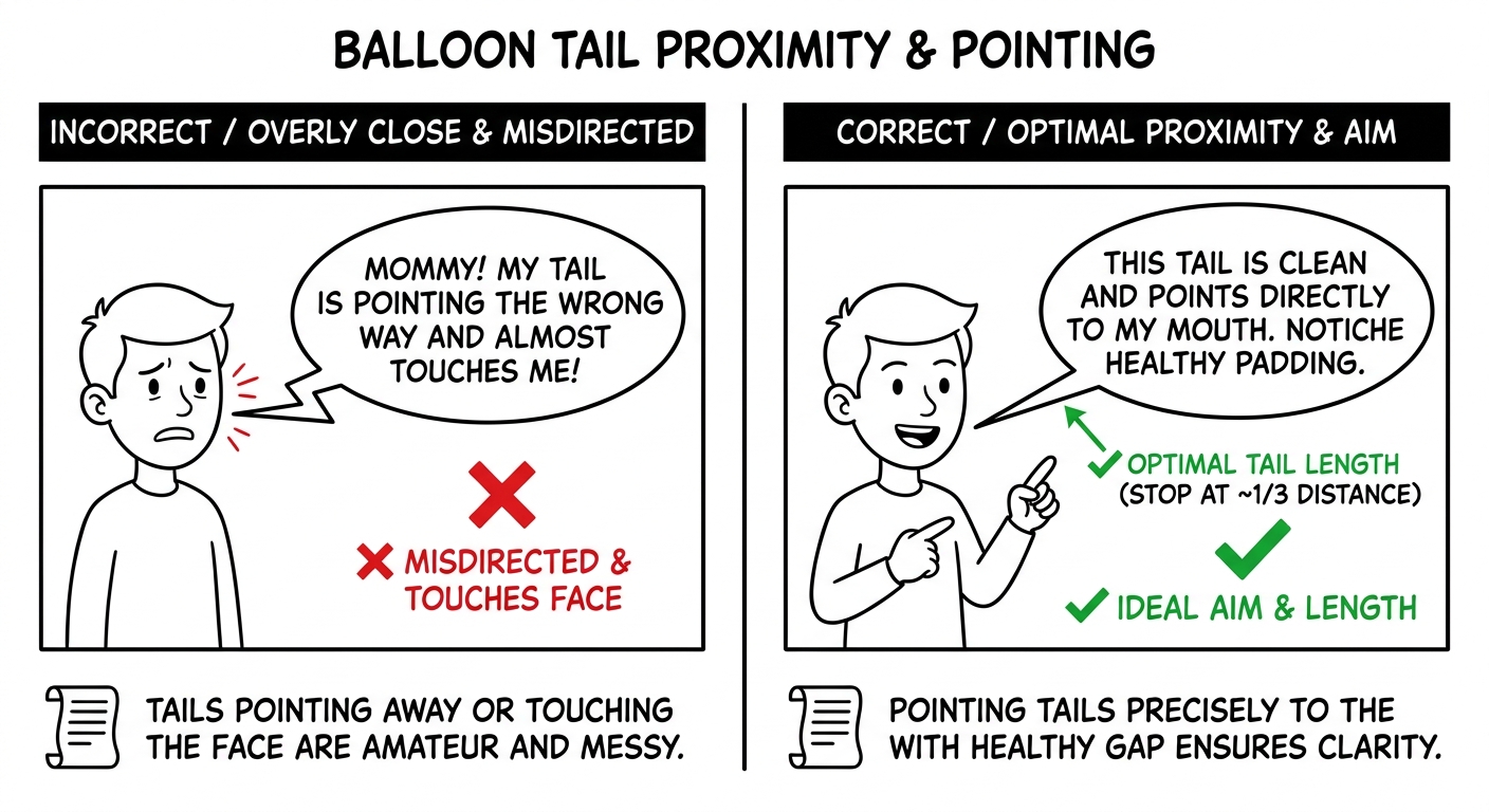
A speech balloon tail should point directly toward the speaker’s mouth. However, never draw the tip of the tail touching the character’s face or head. A clean tail stops roughly one-third of the distance away from the character, pointing smoothly toward the origin of the voice.
Level Up Your Comic Lettering
Mastering dialogue flow takes practice, but following these core formatting principles will instantly raise the quality of your visual storytelling.
Want to see these concepts in action with real visual breakdowns and side-by-side examples? Watch the full video tutorial above!
💬 What's Your Workflow?
Do you letter your pages digitally in Clip Studio Paint, or do you prefer hand-lettering? Let us know in the comments below!
watch my new video about speech balloons:
Social media algorithms hide posts. Subscribe to get new comic pages, video updates, and creator notes delivered straight to your inbox.
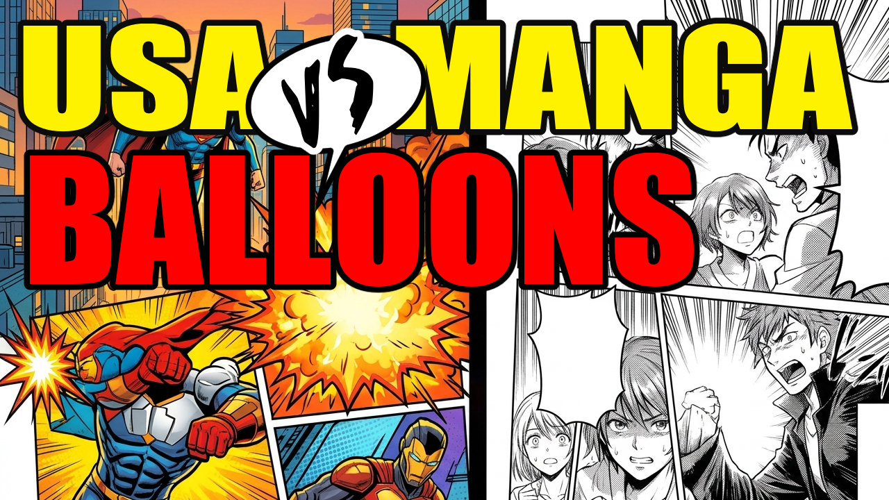
The Art of Dialogue: USA vs Manga Speech Balloons
Latest
American Comics vs. Manga Panels: How to Master Your Page Flow & Pacing
American Comics vs Manga Page Layout
Reimagining Icons: How to Rewrite Classic Characters Without Ruining Them
How to Write a Strong Female Character Without Creating a Mary Sue
READ LEGENDS OF THE WEST GRAPHIC NOVEL

Legends of the West graphic novel cover page for chapter one pencil drawing of a river surrounded by a forest.