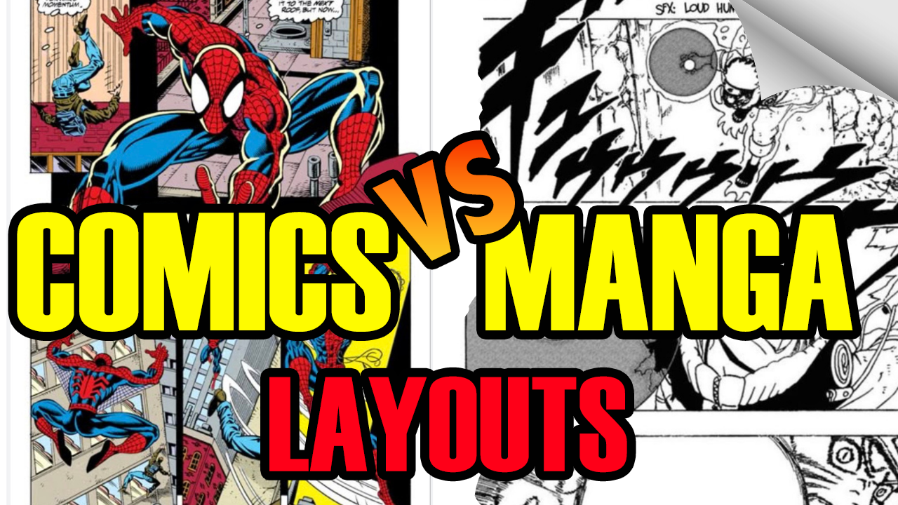
When you pick up a comic book, your eyes know exactly what to do. You scan the top left, move across the page, drop down to the next row, and repeat. But have you ever stopped to analyze why a Japanese manga feels like a fast-paced action movie, while a classic American comic feels like a series of dramatic snapshots?
The secret isn’t just in the illustration style or the dialogue—it lives in the panel structure.
How you divide your page, frame your artwork, and space your gutters dictates the rhythm of your story. In this guide, we’re breaking down the fundamental differences between American Comic Panels vs. Manga Panels so you can master visual pacing and keep readers hooked on every page.
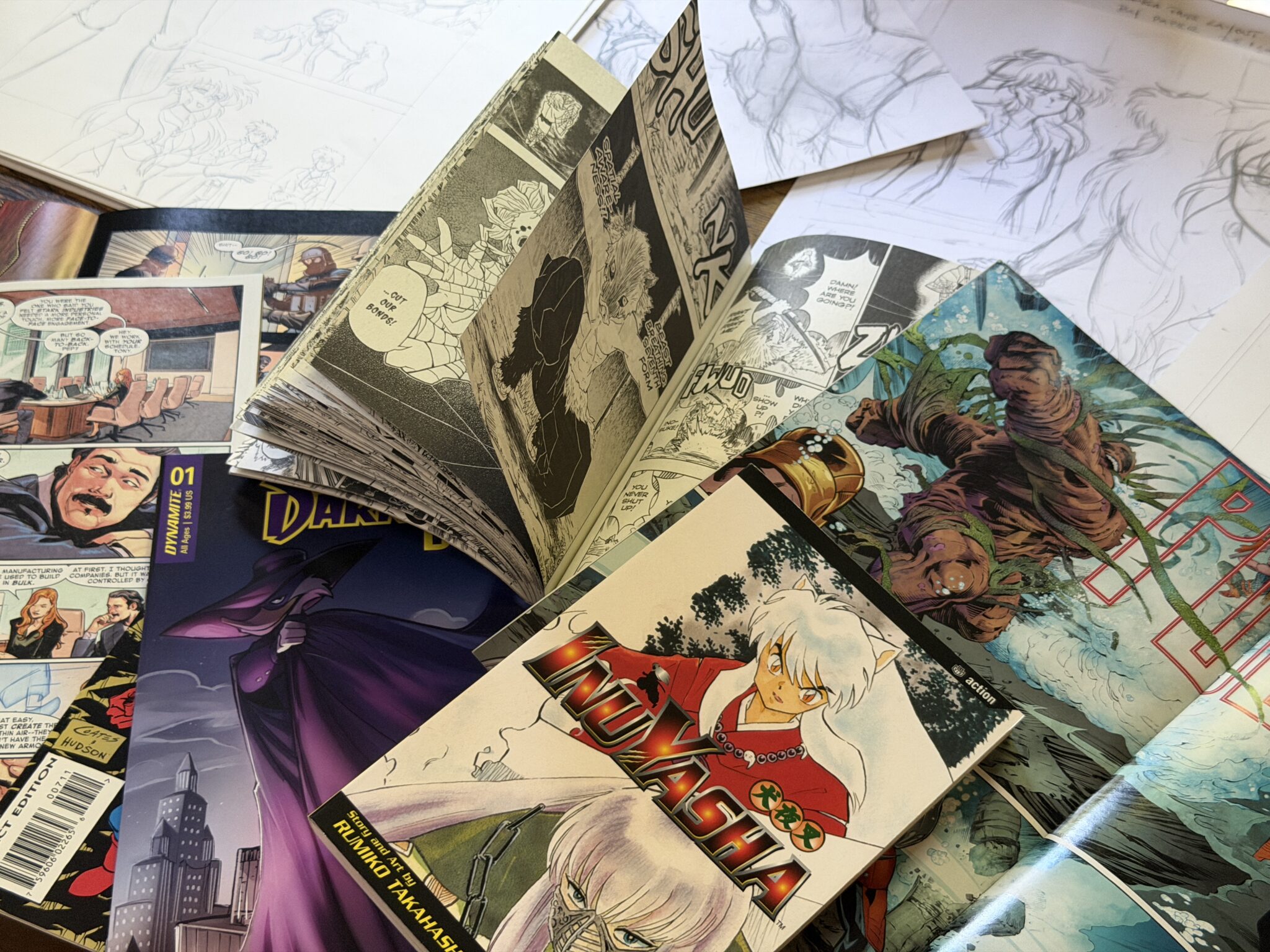
1. Action vs. Atmosphere: Controlling Time
The single biggest storytelling difference between Western comics and Eastern manga comes down to how time moves between panels.
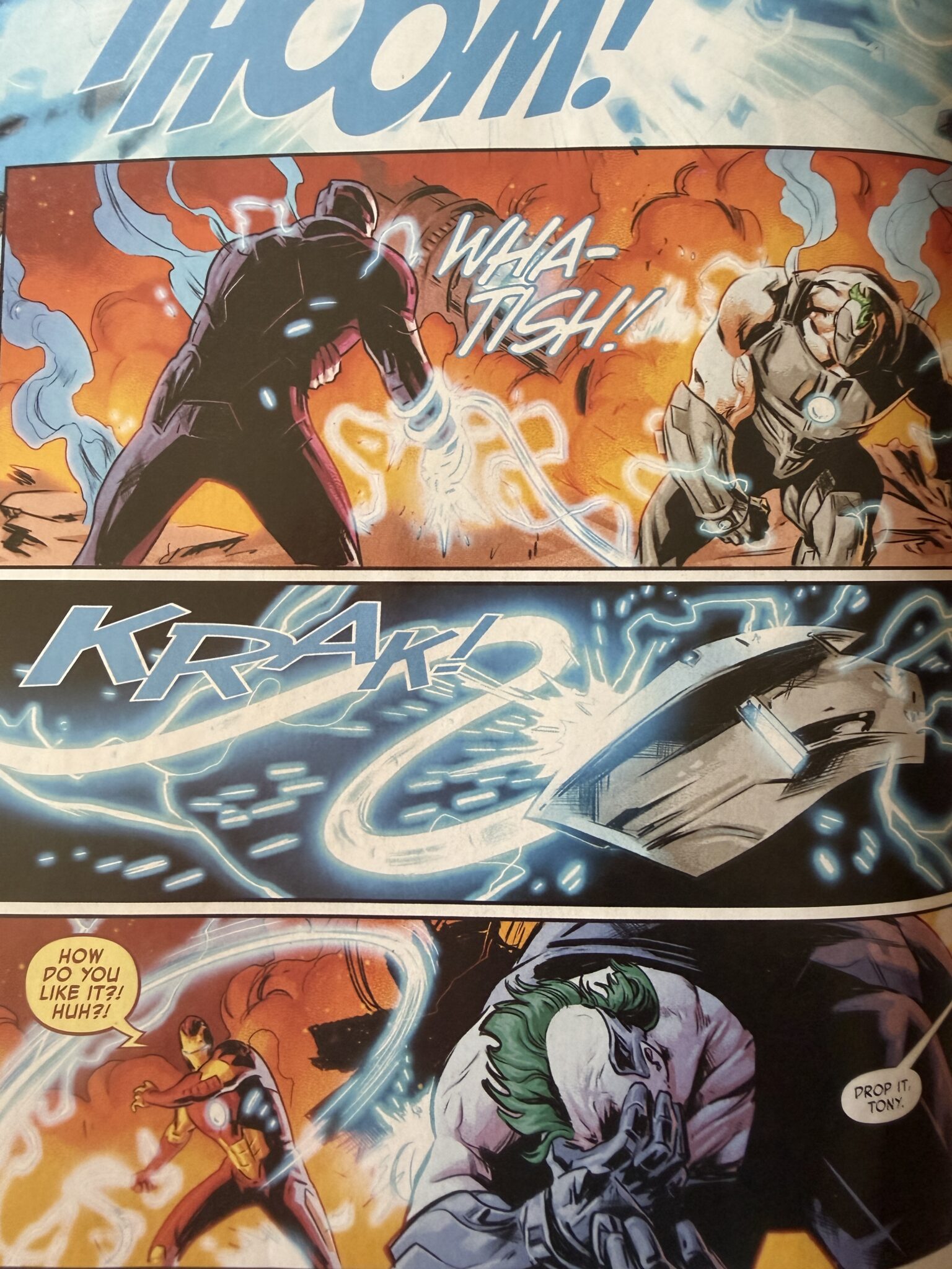
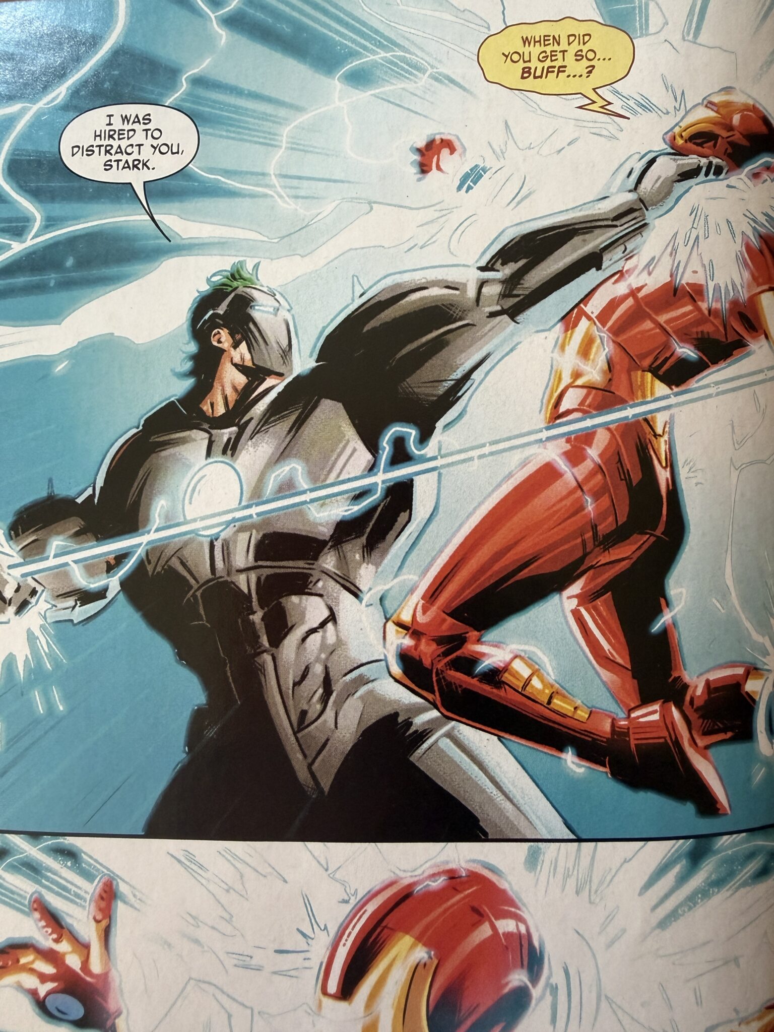
American Comics: Action-to-Action Pacing
Traditionally, American comics face strict page limits (usually 22 to 24 pages per floppy). Because physical space is limited, every panel must carry strong plot momentum.
Western comics heavily rely on Action-to-Action transitions:
-
Panel 1: The hero swings a punch.
-
Panel 2: The villain crashes through a brick wall.
Time jumps forward rapidly from one major physical beat to the next.
Manga: Aspect-to-Aspect & Emotional Pacing
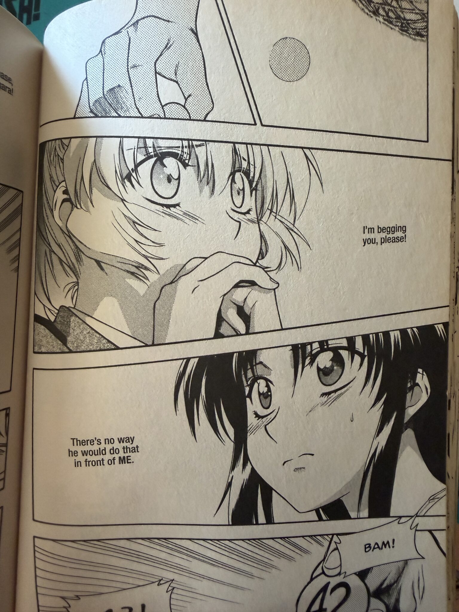
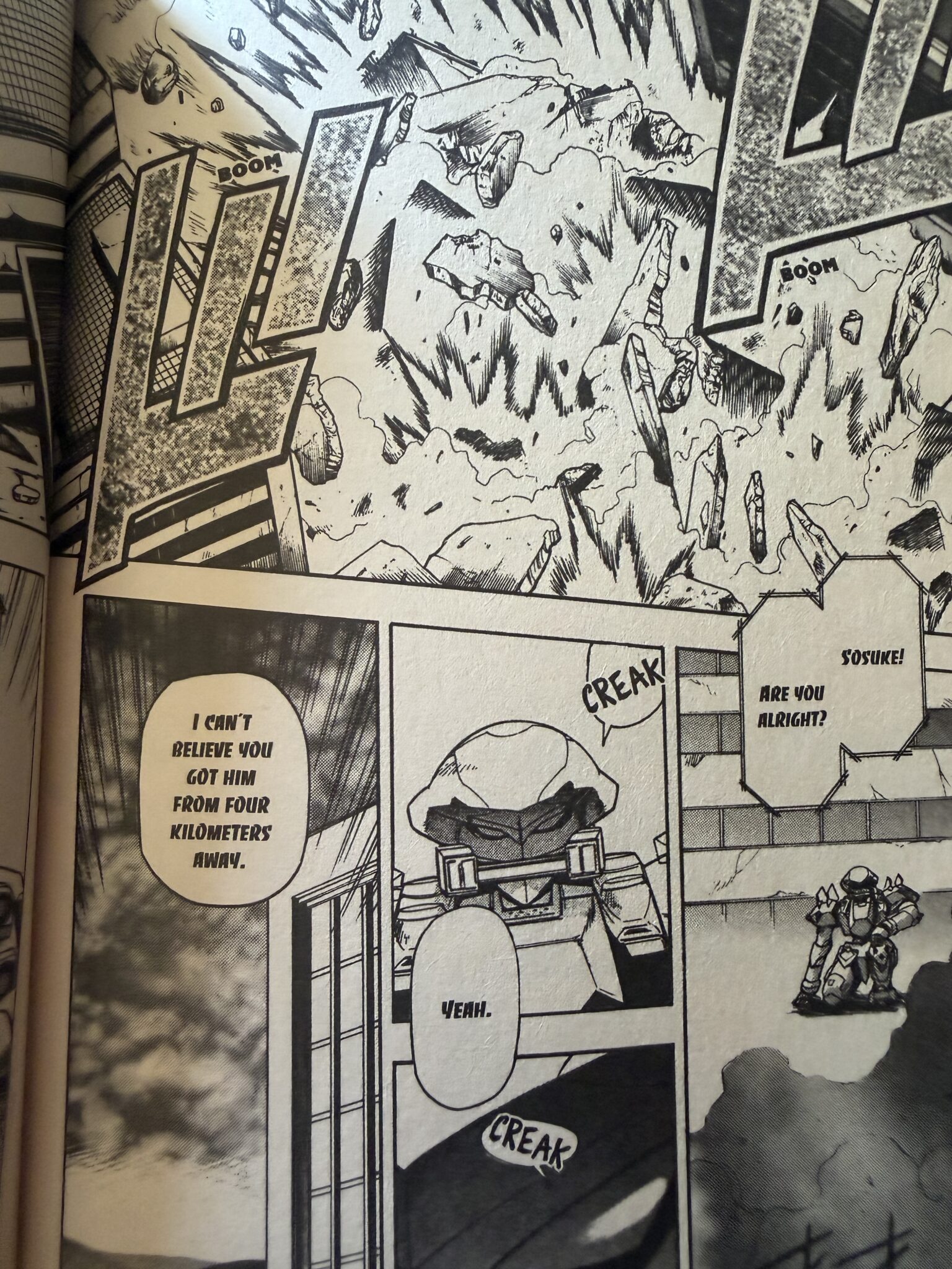
Japanese manga uses serialized anthology formats (like Weekly Shonen Jump), giving creators room to breathe over hundreds of pages per arc. This allows mangaka to utilize Aspect-to-Aspect and Moment-to-Moment transitions:
-
Panel 1: A character's trembling hand reaching for a sword.
-
Panel 2: A close-up of a drop of sweat falling.
-
Panel 3: A wide shot of the wind blowing through dry grass.
-
Panel 4: The sword is drawn.
While American panels move the plot forward, manga panels pause time to build mood, tension, and internal emotion.
The American Uniform Grid
American comics traditionally favor structured, rectangular panel grids. Even when panels tilt for an explosive fight scene, they usually keep distinct, uniform outlines. The panel border acts like a solid frame, keeping the artwork inside a neat container.
2. Rigid Grids vs. Fluid Frames
How you draw your panel borders creates the "lens" through which your audience views your world.
+-------------------+   +-------------------+
|  American Grid    |   |    Manga Flow     |
| +-------+-------+ |   | +-------+ /-----/ |
| |       |       | |   | |       |/     /  |
| +-------+-------+ |   | |-------/     /   |
| |       |       | |   | |      /     /    |
| +-------+-------+ |   | +-----/-----/     |
+-------------------+   +-------------------+
Manga’s Fluid Framing
Manga treats panel borders as fluid guidelines rather than brick walls. You will frequently see:
-
Borderless Panels: Removing top or side borders to represent memory, deep thought, or floating in time.
-
Diagonal Slashes: Sharp, angled gutters that physically speed up the reader’s eye during fast combat.
-
Breaking the Grid: A character’s figure breaking completely out of their panel box and stepping over the gutter into the next scene. If an emotion is big enough, the frame can't hold it
3. The Psychology of Gutter Widths
Here is the subtle technical trick that separates amateur layouts from professional pages: Asymmetrical Gutter Spacing.
In standard Western comics, the white space between panels—the gutter—is almost always uniform (e.g., 0.25 inches both horizontally and vertically).
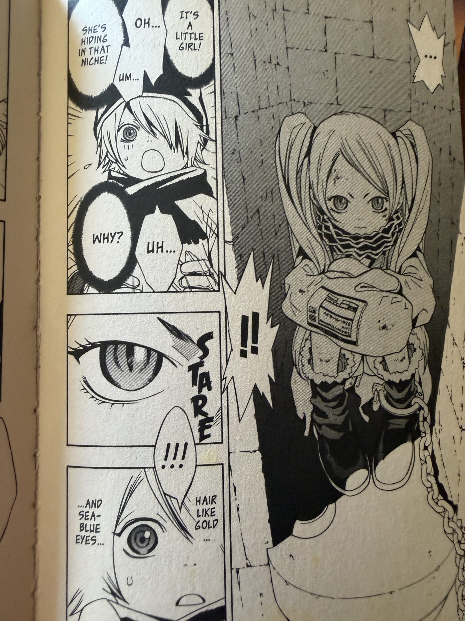
In manga, gutter spacing is a visual directing tool:
-
Horizontal Gutters (between rows): Drawn wide (around 5mm to 8mm).
-
Vertical Gutters (between side-by-side panels): Drawn thin (around 2mm to 3mm).
-
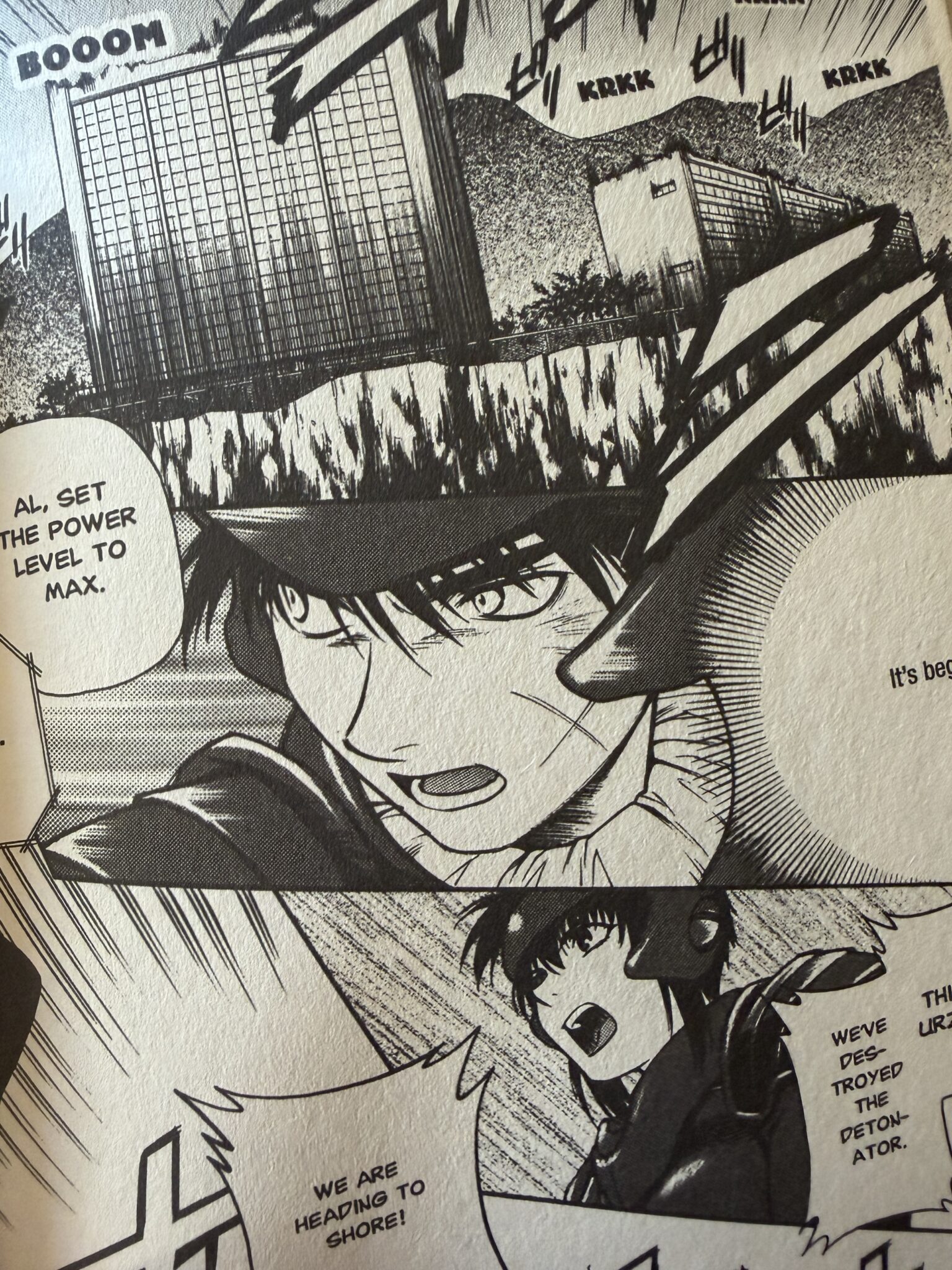
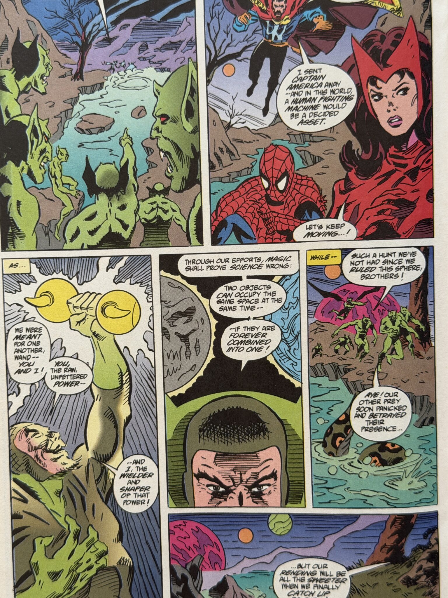
Why does this matter?
Your brain naturally follows the path of least resistance. The thin vertical gap links adjacent panels together into a single "sentence," while the wide horizontal gap acts as a "period," telling your eyes: "Stop, finish this row, then jump down." This simple trick eliminates reader confusion and makes fast scanning effortless.
Watch the Full Panel Pacing Video Guide
Want to see these paneling mechanics demonstrated in real time? Check out the full video breakdown below:
Which Panel Style Should You Use?
You don't have to pick just one! Modern indie graphic novels blend Western action grids with manga emotional pacing all the time.
The goal isn't to copy a style blindly—it's to use these tools deliberately. Use rigid grids when you want your scene to feel grounded and structured, and break out into borderless, slash panels when the emotional stakes explode.
What’s Your Favorite Paneling Technique?
Are you a fan of clean, structured grids, or do you love dynamic, borderless manga layouts? Drop a comment below or join the discussion over on Instagram
Want to see these principles in action? Follow the production journey of my graphic novel,



American Comics vs. Manga Panels: How to Master Your Page Flow & Pacing
Latest
American Comics vs Manga Page Layout
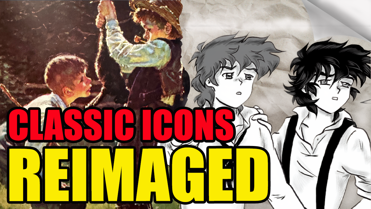
Reimagining Icons: How to Rewrite Classic Characters Without Ruining Them
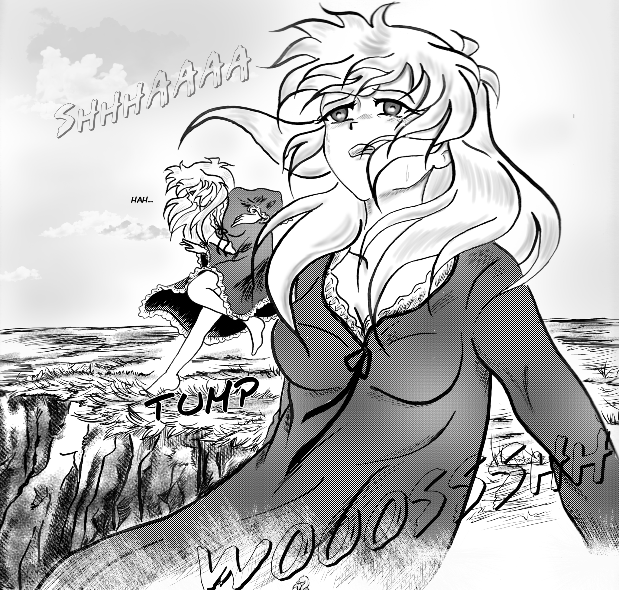
How to Write a Strong Female Character Without Creating a Mary Sue
From Joker to Darth Vader: What Makes a Truly Iconic Villain?