American Comics vs. Manga Page Layout: The Ultimate Artist’s Blueprint
However, if you look at the global comic landscape, you will quickly notice a massive divide in how pages are built. Specifically, the structural differences between American comic book pages and Japanese manga pages are night and day.
In this complete guide, we will break down the exact paper sizes, margins, and layout rules for both formats so you can format your artwork perfectly every single time.


The Universal Rules of Page Layout
Before we dive into the specific measurements, we must first understand the anatomy of a comic page. Regardless of whether you draw Western superhero comics or Japanese manga, every professional template utilizes three essential boundary boxes.
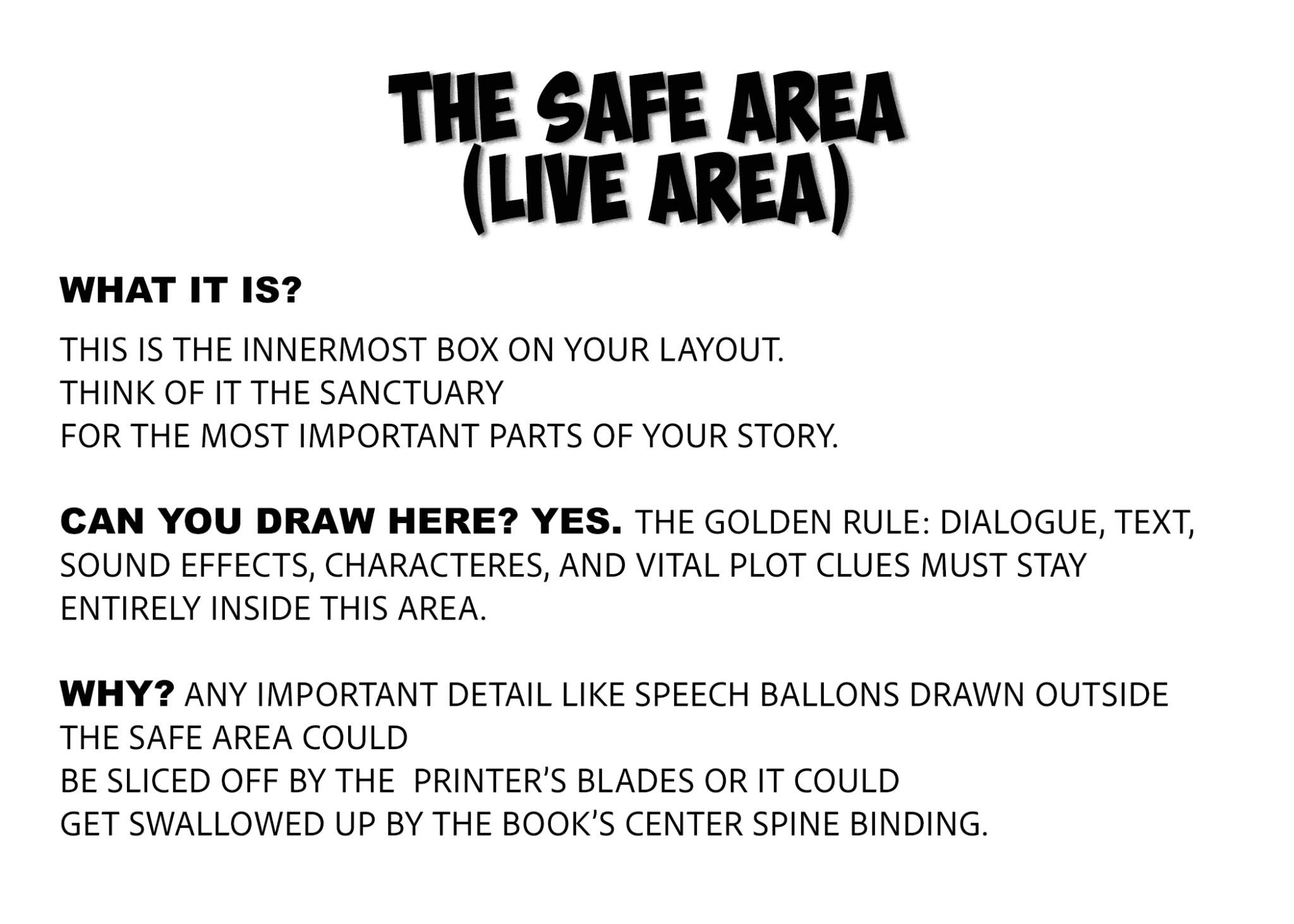
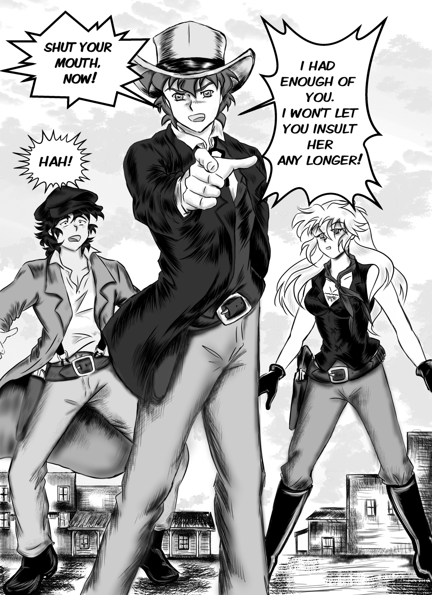
The Safe Zone (Live Area): This is the innermost sanctuary of your page. Consequently, every single piece of dialogue, speech balloon, face, and critical plot point **must** stay inside this box. If you place text outside this zone, it will likely get swallowed by the book’s center binding (the gutter) or trimmed off entirely.
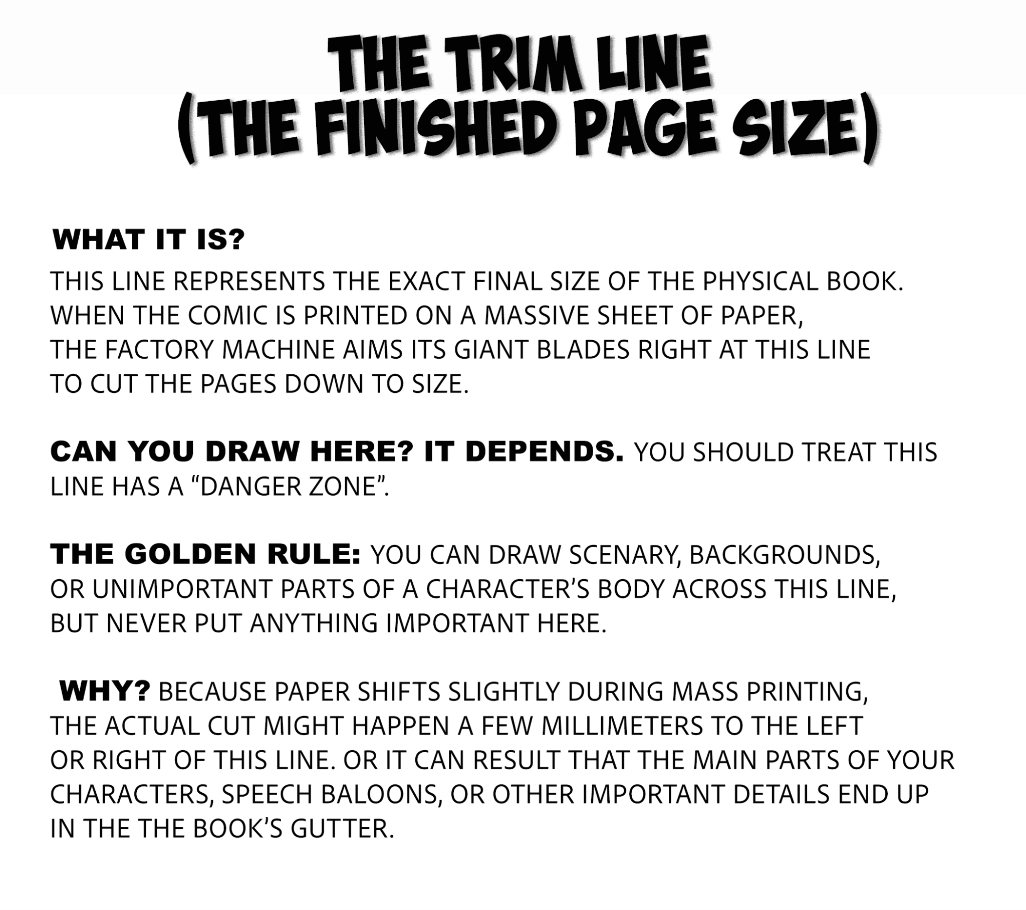
The Trim Line: This line represents the exact final size of the physical book. When the publisher prints your comic on a massive sheet of paper, the factory machine aims its giant blades right at this line to cut the pages down.
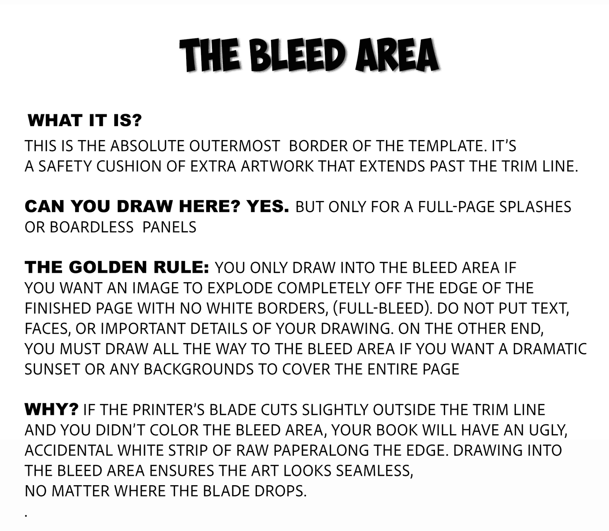
The Bleed Area: This is the absolute outermost border of the template. If you want an artistic panel or a dramatic background to explode entirely off the edge of the finished page with no white borders—called a "full bleed"—you must draw all the way out to this line.
American Comic Book Layout Standard
Traditionally, American comic creators draw much larger than the final printed book. By creating the artwork on a larger canvas, the lines look incredibly crisp and detailed when scaled down for publishing.
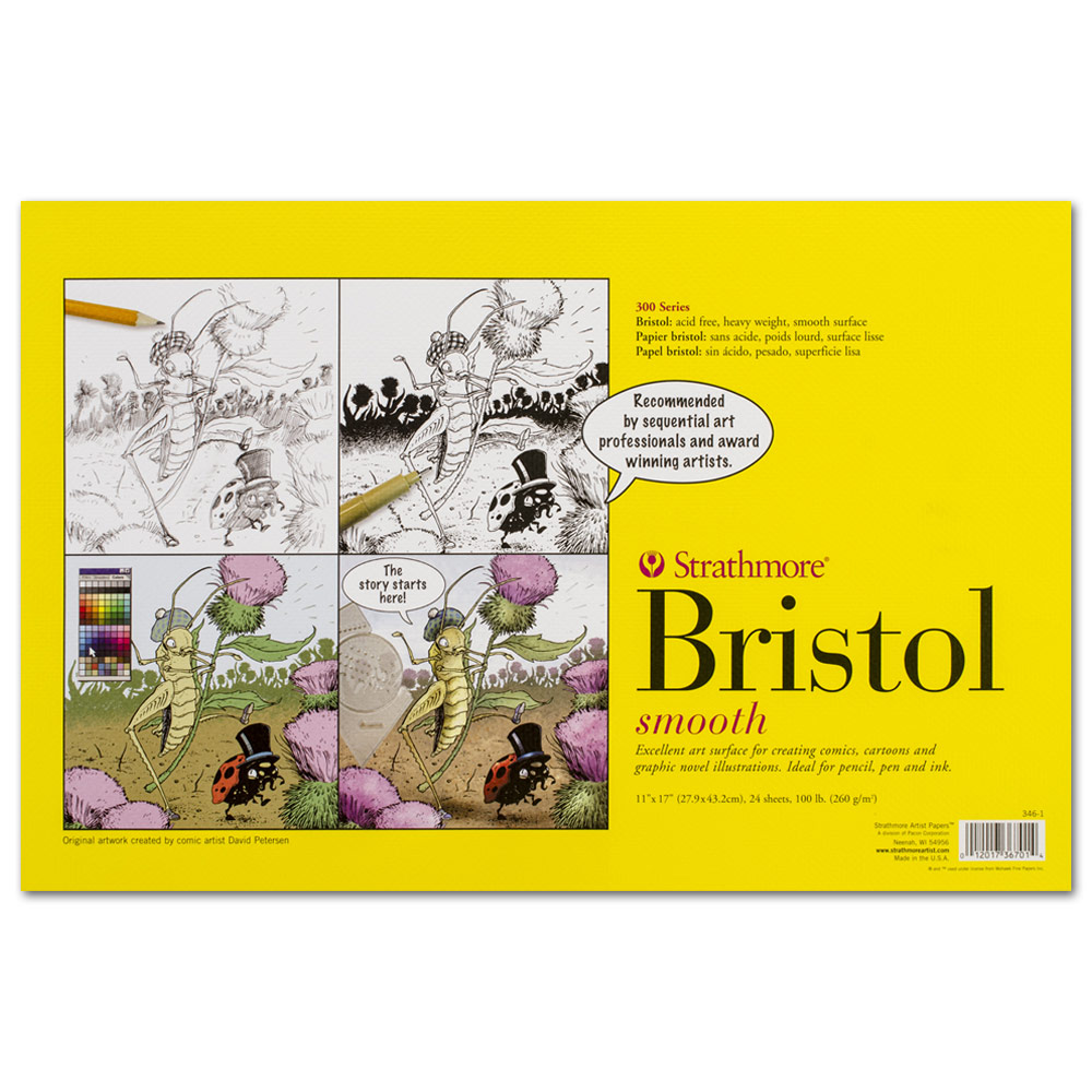
In the US industry, artists standardly work in inches and draw on heavy 11" × 17" Bristol Board.
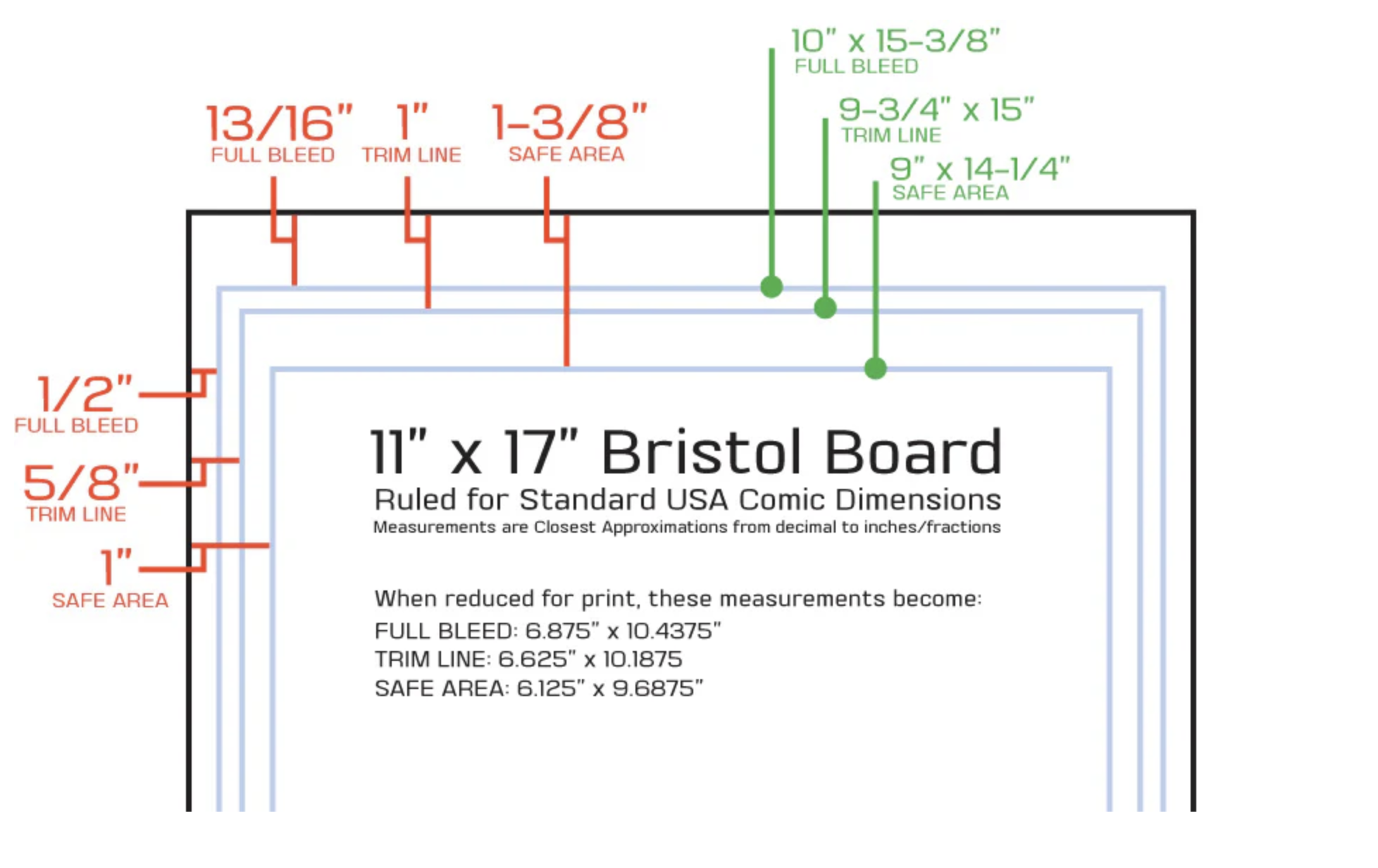
The Standard 11" x 17" Dimensions:
-
Safe Zone / Live Area: 9" × 13.5"
-
Trim Line: 10" × 15"
-
Bleed Area: 10.375" × 15.375"
The Final Result: When the comic book is shrunk down and printed as a standard "floppy" comic book, the final retail size becomes 6.625" × 10.25".
Japanese Manga Layout Standard
In contrast to the Western system, the Japanese manga industry uses metric millimeters and aligns its templates with standard international paper sizes. Professional mangaka draw on specialized B4-sized manuscript paper (Manga Genkouyoushi).
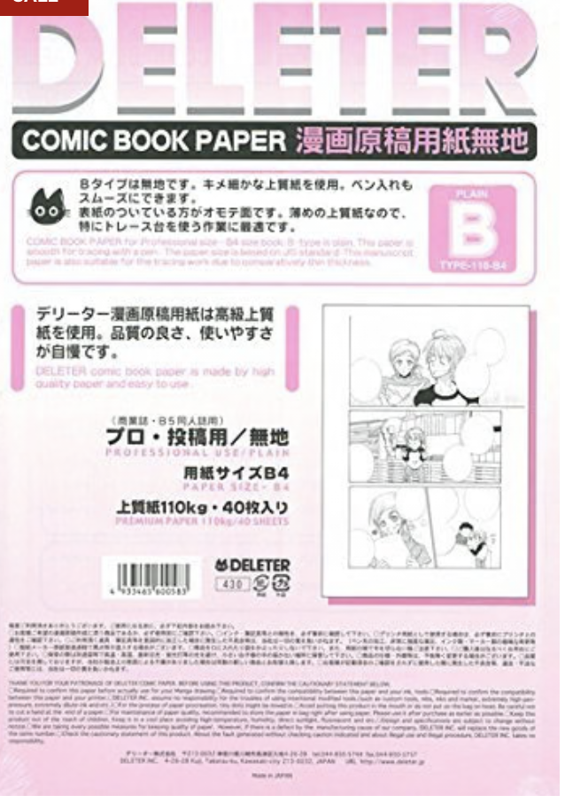
Because manga is heavily scaled down for retail tankōbon volumes, the drawing dimensions require absolute precision.
The Standard B4 Dimensions:
-
Safe Zone (Kihon Waku): 180mm × 270mm
-
Trim Line (Finished Size): 220mm × 310mm
-
Bleed Line (Tachikiri Sen): 226mm × 316mm
The Final Result: When printed in standard manga magazines, the art is shrunk down to roughly 83% of its original size. Furthermore, when collected into the smaller graphic novel volumes you buy at bookstores, it is scaled down drastically to about 67% of its original size (approx. 5" × 7.5").
💡 Pro-Tip for Indie Creators: If physical B4 paper is too difficult to source in your area, many indie manga artists utilize A4 paper templates, which scale the inner Safe Zone down to 150mm × 224mm.
Key Differences: American Comics vs. Manga Layouts
Beyond the raw math and measurements, the structural rules for framing panels change heavily between the two formats due to cultural reading habits and visual pacing.
1. The Canvas Aspect Ratio
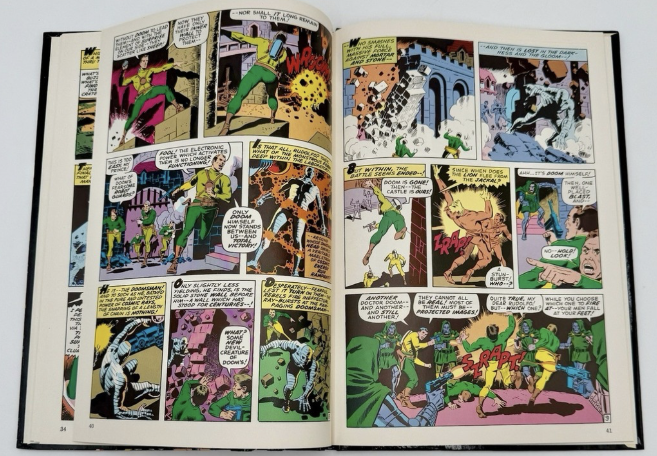
First and foremost, American comics favor a taller, narrower canvas (roughly a 2:3 ratio). As a result, this layout naturally encourages the vertical stacking of panels and expansive, tall hero shots. On the other hand, a manga canvas is slightly wider relative to its height, which perfectly accommodates cinematic, horizontal pacing.
2. Reading Direction and the Spine Trap
Because Japanese manga reads Right-to-Left, the formatting layout is completely reversed compared to American books. Therefore, you must be incredibly mindful of the book's spine. On a left-hand page in a Western comic, the right edge is glued into the spine, meaning text must stay away from the right. In manga, the left edge is glued into the spine, requiring you to flip your spatial awareness entirely.
3. Psychological Gutter Spacing
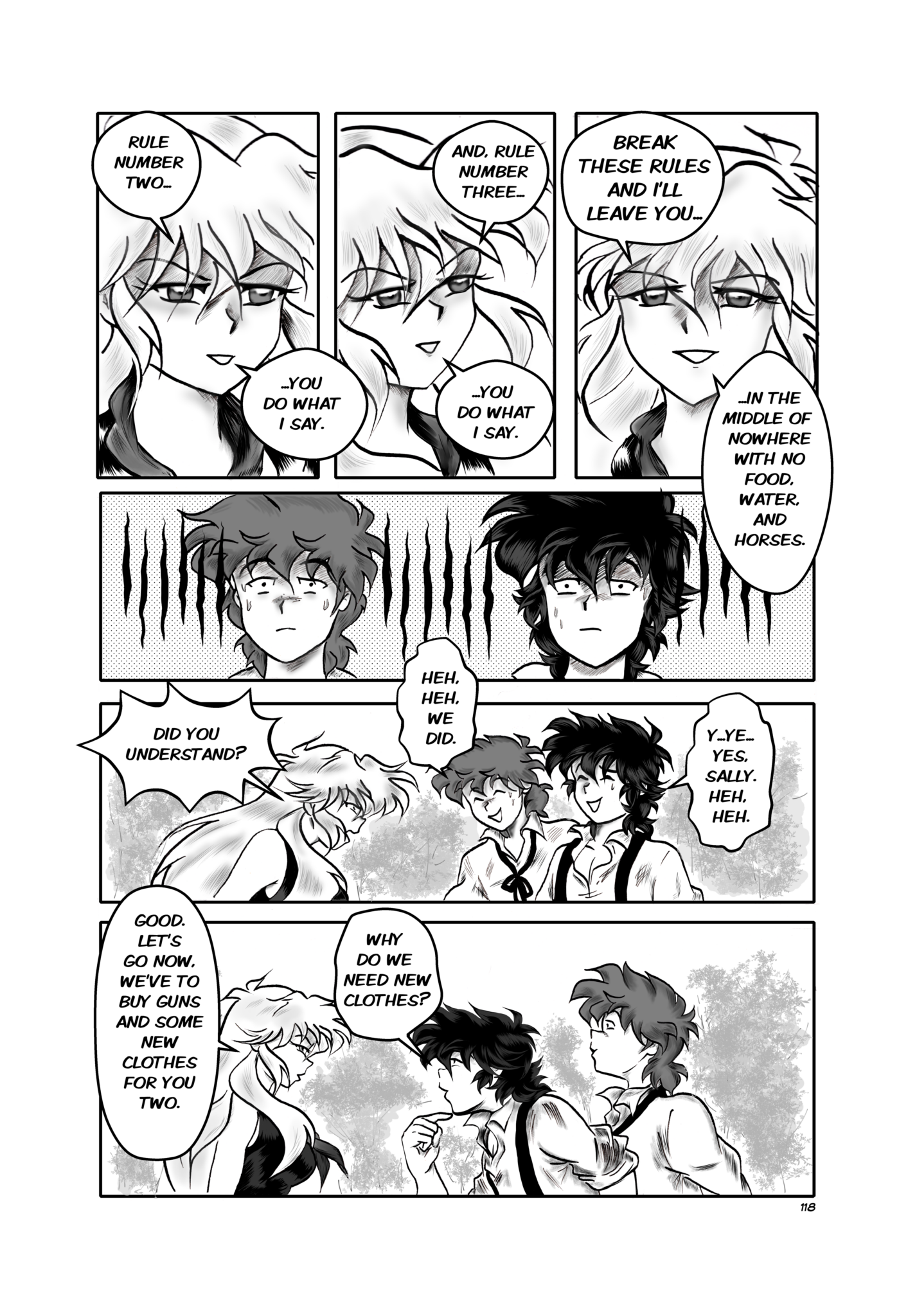
In American comics, panel gutters (the white spaces between panels) are usually perfectly uniform in size across the entire page. Conversely, manga follows a strict psychological framing rule. The horizontal gutters between rows are intentionally drawn wide (around 5mm to 8mm), while the vertical gutters between side-by-side panels are drawn thin (around 2mm to 3mm). Ultimately, this subtle trick tells the reader’s brain exactly how to track the panels chronologically without getting confused.
Conclusion: Choose the Right Tool for Your Story
Ultimately, neither layout style is inherently superior; it completely depends on the story you want to tell. If you are aiming for a classic, vertically stacked graphic novel look, the American standard is incredibly reliable. However, if you want dynamic, borderless panel action that flows across a wider screen, manga's B4 format offers unparalleled freedom.
Are you currently designing your comic pages digitally in Photoshop or drawing traditionally with a ruler? Let us know your preferred workflow in the comments below!
For more behind-the-scenes drawing tutorials and updates on our upcoming graphic novel project, Legends of the West, stay tuned right here to
READ LEGENDS OF THE WEST GRAPHIC NOVEL

Legends of the West graphic novel cover page for chapter one: pencil drawing of a river surrounded by a forest.
Social media algorithms hide posts. Subscribe to get new comic pages, video updates, and creator notes delivered straight to your inbox.
American Comics vs Manga Page Layout
Latest
Reimagining Icons: How to Rewrite Classic Characters Without Ruining Them
How to Write a Strong Female Character Without Creating a Mary Sue
From Joker to Darth Vader: What Makes a Truly Iconic Villain?

Traditional Hero vs Anti-Hero